Artist: Patrick Hughes

Image result for patrick hughes

Patrick Hughes is an artist who is renown for his optical illusions. The majority of his work consists of 3D surfaces where you can see different aspects of the artwork from different perspectives.

He had his first show at the Portal Gallery in London, 1961. Making it the first one-man show by a Pop Artist, a few years later he created two pieces ‘Infinity‘ and ‘Sticking-Out Room‘, two seminal reverse perspective pieces. During the 1970s his name was becoming recognised due to his unique pieces leaving people perplexed when looking at the optical illusions. A big part of some of his pieces are rainbows which gained popularity and became stamps but to Patrick, it had a somewhat of a sentimental meaning.

Image result for patrick hughes infinityInfinity| Patrick Hughes 1976

The purpose of those confusing pieces is not to bemuse the viewer but to “experience unreality and the paradox of illusory space and movement“.

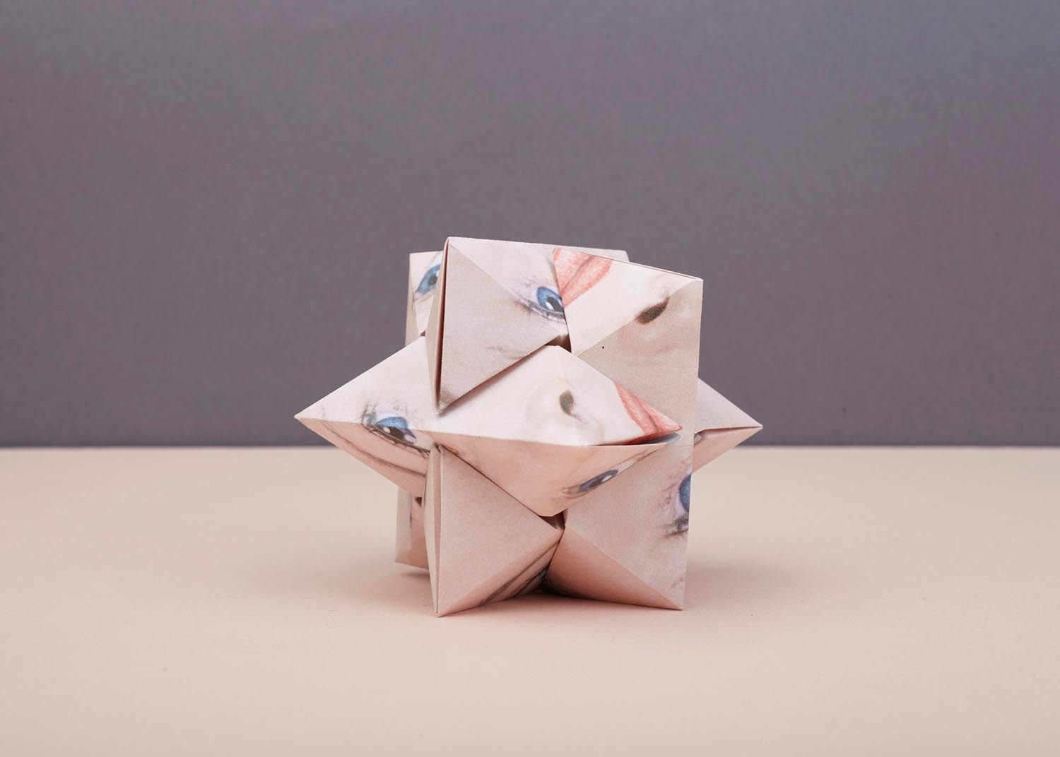
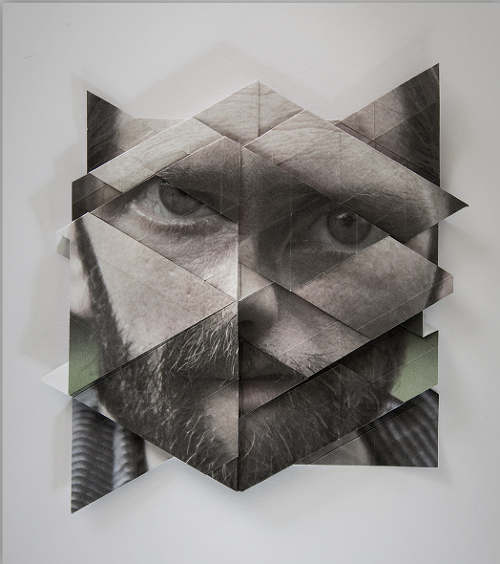
My initial idea for my final piece was to create something similar to his pieces as I thought it was an incredibly creative way to create art, although I am no longer planning to continue with that piece I still want to incorporate his style into my new piece. This is because I thought the 3D aspects of his pieces give the piece so much more depth and does allow viewers to stop and stare in astonishment as it is not something you usually expect.

In 1975 Patrick teamed up with George Brecht and collaborated on ‘Vicious Circles and InfinityA Panoply of Paradoxes‘ the first book on the paradox sold 100,000 copies followed by being translated into Japanese, Spanish, German and Dutch.

During his younger years, Patrick found himself taking refuge within books to escape his problems. In his biography (found on his website) he says “A book is a way out, they are little doors – you open the hinged rectangle of the book and step out.” He continues by saying, “I escaped my suburban hell hole of an upbringing, through a book.

Related image

The Institute for Contemporary Art invited 10 artists to take a room in 1970, Patrick Hughes was one of them. There he created a 12ft by 8ft sticking out room within that room, he met Angela Flowers later that year who was setting up her own gallery. She asked him to be the first artist to have a piece showcased in said gallery.

During the beginning of 1970 he spent his time painting rainbows which became largely popular; people believed them to be quite cheerful and uplifting but Patrick said “they were acts of subversion, visual puns“.


Artist: Szymon Roginski

Image result for szymon roginski ufo       Related image

Szymon Roginski is a Polish photographer, he graduated in 2000 Artistic Photography Studies after studying there since 1999 . In 2005 he began a series he called “UFO” where he traveled to different locations and used artificial lighting to create an eery atmosphere.

Image result for szymon roginski Image result for szymon roginski sculptural photography

He also did a series in which he turned his photography into geometric shapes, completely transforming them into something new. To do so, he manipulates the image by folding it until he gets the shape he wanted or the shape he feels suits the piece.

Although the image is slightly distorted, the detail remains intact and the image itself is still easy to make out.

In my opinion the two images can contrast each other, the first image almost looks as though there are boulders falling onto the person laying in the centre or they are trapped under them. The boulder-like shapes almost look as though they have just been thrown down onto them which can give a sense of heaviness almost like doubts and worries, which are weighing them down.

The boulders could represent their anxious thoughts; holding all their fears that seem to prevent them from continuing their life such as the fear of failing, failing their friends, family or even just failing themselves.

Whereas the other image is very carefully pieced together; the main focus being the model in the centre who looks almost at ease, so each piece of image stuck down can symbolise a part of their life falling into place. The missing pieces could be the parts of their life they have left in the past or had no choice but to leave it behind.

However on the other end of the spectrum, it could be the polar opposite and the pieces are being torn off almost like somebody mistreating them and it is slowly wearing them down but they don’t fight back, they just let it happen which only makes them prone to more of the abuse.

Image result for szymon roginski

This image gives off a similar feeling as the image with the boulders, the pyramid shapes placed in such close positions makes it seem as though she is trapped, like she is held hostage as the spiked tips create the illusion that they are sharp. With her in the centre, it makes her the primary focus and also gives the sense that she is being held against her will.

On the other hand they could symbolise protection. Her facial expression seems cold rather than fearful, so on the contrary to my previous point those “spikes” could be protecting her from something or someone. Although, it also seems as though she is waiting for something as if she is completely aware of the inevitability of the danger but instead of fearing it she is waiting patiently.

Artist: Jérémy Tourvieille

Image result for Jérémy Tourvieille        Related image

Jérémy Tourvieille is a graphic designer and photographer from Paris, he moved to Switzerland in order to finish his studies in Geneva. Always being drawn to graphics after seeing pieces in galleries and museums, he later became a graphic designer and then created his own fonts after finding another passion, in typography.

He found his inspiration from contemporary art, some being found on sites such as Pinterest and Behance.

When I first came across his work, I found myself instantly intrigued. The lines and the circles give the images a sense of depth, personally I think it can symbolise identity quite well; the circles in the second image could mean the different layers of identities as everyone goes through a time in their life where they experiment to try and discover who they truly are and to me, this piece showcases that.

The first image can also show that, due to the serious facial expression which almost looks like a hurt expression.

Related image

The majority of his work have a similar theme; black and white whilst a single part of the model’s face becomes one of the main focuses, usually the eyes.

Image result for jeremy tourvieille advertisement  Image result for jeremy tourvieille mapping festival

However some of his pieces involve similar themes, bold text is placed over the top to gain more attention, as the colourful font stands out easier as the images are black and white. This makes the text the main focus, but the fact that the text is slightly jumbled rather than being in a line makes it a little harder to read causing the reader to piece it all together.

Image result for jeremy tourvieille mapping festival

He also has some other advertisement using a different theme but also keeping it similar at the same time, it still has the black and white and still has the bold lettering but it has some other effects. The black triangles almost form a mask over the top half of her face, once again linking to identity; a mask commonly being used to hide your face, meaning she could be ashamed of who she is or who she is becoming.

When you look closer to the image, you see the black triangles are multiple layers of her face as you can only just make out the eyes, which also helps link it to identity as it could be her masking her true identity with fake personas.

Artist: Colette Fu

Colette Fu was raised in New Jersey,  graduating with a degree in both French and literature however it wasn’t until she switched courses as she ventured to China. Here she discovered her passion for storytelling and photography, she moved back to the United States where she later earned a MFA in photography.

Large-scale pop-up book shows a young woman with street-food from a region in China.

Once relocating in Philadelphia, she began to truly explore her passion. Colette then taught herself how to create pop ups after becoming fascinated by them and later received a Fullbright Fellowship in 2008, allowing her to create her art based around the Yunnan people which later inspired her “We are the tiger people” series which goes in depth about their culture; their food, traditions and the religious aspect of it.

Colette has also done work for Vogue China, Canon Asia, Moët Hennessy Louis Vuitton (LVMH) and also designed China’s largest pop up book. Colette also teaches classes locally and even abroad.

Artist: Alma Haser

Alma Haser is a German artist who specialises in portraiture due to her background in fine art. Using her knowledge on photography and collages, she combines both techniques to create abnormal shapes using a printed image of a person’s face. During 2010, Haser finalised her Photography degree and has won several awards throughout the years; including The Magenta Foundation’s Bright Spark award in 2013.

She did a series using these 3D pieces to place them over the face creating a set of unique and abstract pieces.


The series, Cosmic Surgery was originally meant to be called “Cosmetic Surgery” as she said it appeared as though the subjects had undergone plastic surgery, however Alma had a habit of talking very quickly and her dyslexia caused her to mix words up. Although it was a mistake, she liked the name for it and even said it fitted the theme as they all look like they’re from another world.

Some of the shapes seem a lot more complex than others, some have only a couple of sides creating a softer look to it whilst others have a larger amount of shapes causing the image to gain a very jagged and almost threatening look.


Another one of her series of artwork is called “Pseudo” which is possibly one of my favourite pieces she has done. It isn’t something I have ever seen and yet I am so fascinated by it. None of her pictures are identical, they may have a similar theme but they have different colours, shapes and a completely unique aesthetic overall.

Alma said that she is in a constant search for new ways to shape her work and new ways to explore to expand her knowledge, she also said that the majority of her finished pieces are usually done accidentally but only after many hours of experimentations.


Alma’s most recent series was named “Within 15 Minutes” where she created several 1000 piece puzzles with impressive attention to detail. What makes it even more impressive is the fact she did this all by hand, presumably taking up an incredible amount of time. The end result definitely being worth it.

Artist: Aldo Tolino

Aldo Tolino is an Austrian artist who attended the University for Applied Arts where he received a PhD after focusing his research on art, games and media theory. Although he is known for his incredible artwork, he is also a philosopher; he is currently working on a book which contains some of the techniques he has explored before such as sculptures, paper folding and textures.

Aldo is best known for using digital art to create disproportioned portraits, most commonly using a person and creating a distorted sculpture of their face. He does this by printing a portrait photograph and folds it repeatedly, taking it apart and then folding it all over again in order to get the piece he had envisioned, then photographing the end result.

The piece shown above is called “Faust als Marionettentheater” a piece based on the Salzburg Marionette Theatre which was originally founded in 1913 by Professor Anton Aicher. On his website there is a quote by Gretel Aicher, where she talks about her passion for marionettes, “What then is the fascination of a life with marionettes? Is it the pleasure of performing? The appeal of mastering an ‘instrument’ to the point of virtousity?” she later said “the transformation of one’s self?” which makes me believe this piece is based around finding your own identity.

Portraits aren’t where his pieces end, he does landscape pieces where he does a similar thing with the portraits but it has pictures of lakes and mountains compacted into one piece.

This piece is called “Mother” which is a motherboard which is generally found in microcomputers. This piece shows his knowledge on this topic and being able to transform it into a work of art.

Personally, I like a lot of his pieces such as the one above. It is abstract and quite easy on the eye compared to some artist who do a similar theme, they have big, bold colours that can sometimes really clash. His pieces have so much depth to them as they might seem like a distorted portrait but later if you read, they have such fascinating meanings.