Light Tracing (Experimentations)

After doing some research on Ian Egner, I became inspired to do light painting/tracing. Some of the photographs weren’t as good as I had originally hoped, but I still liked doing it nonetheless.

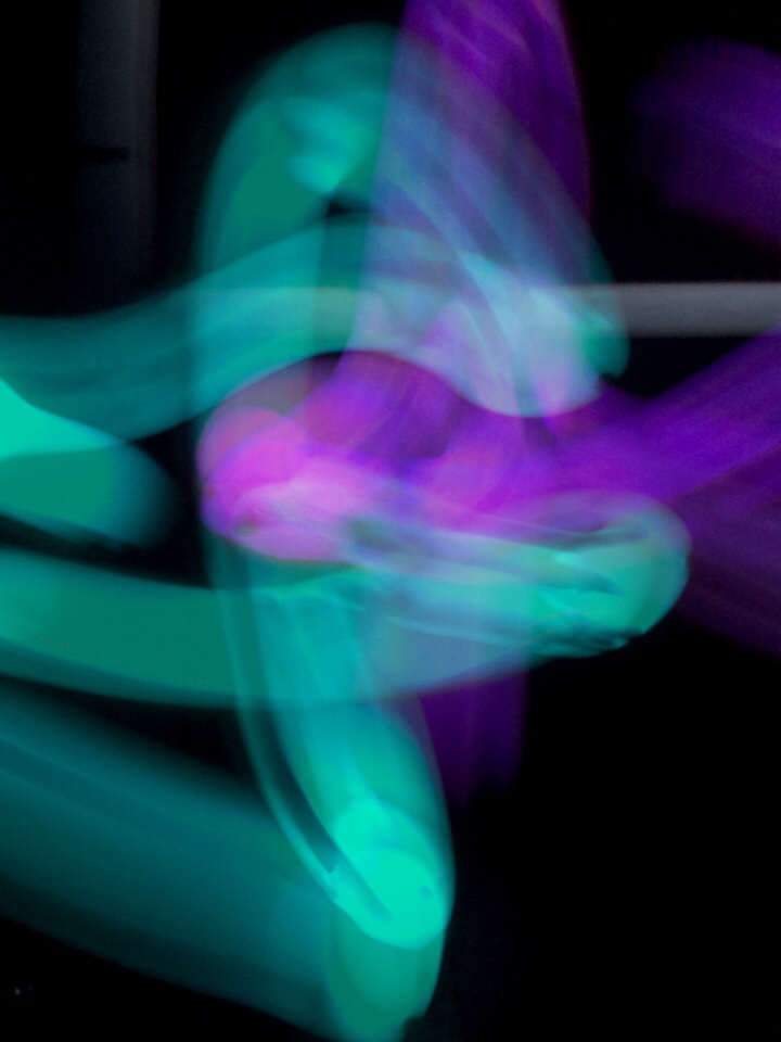
I asked my sister to hold up a multicoloured light in a completely dark room and slowly move it in random patterns.

We did try to write but it wasn’t as successful as our other shots. I had her repeat the same method to see how it looked before we mixed it up a bit.

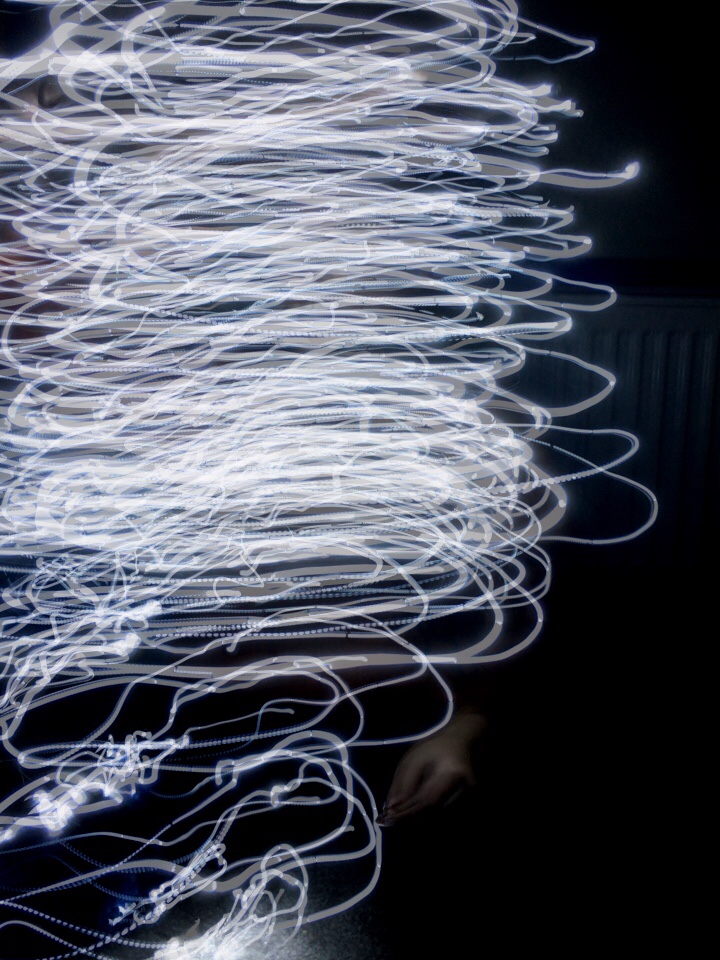
After searching the house for a while we found a light up wand and decided it was better than nothing. Originally, I wanted to use the flashlight on her phone but it was too bright.

I really enjoyed doing light tracing, it was so much fun to try and get different patterns. Once I took the photos I edited them by changing the colours of the lights to see which theme I preferred.

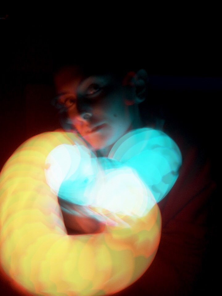
After a while, I tried incorporating her face into the image to see how that looked and I actually thought this was a lot more interesting than some of the other images.

It could have gone better but it is still a result that I am happy with.

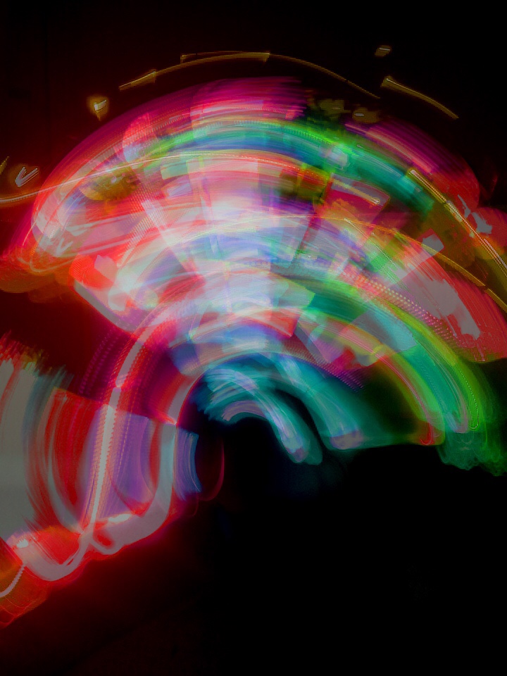
We then found some fairy lights and began to experiment with different movements; slowly and then moving it a little quicker, I made her draw with them and also just twirl them at various speeds.

Artist: Ori Gersht

Ori Gersht is a Israeli artist who is best known for his slow motion capture photography. The majority of his work is still life, he takes photos of; flowers, vases and other ceramic items.Related image

On his personal website, it states that his work hinges heavily on historical reference used as metaphors for contemporary life Gersht’s photography is recognised for the capturing of an explosion, sometimes it is moments before the object breaks and other times it is right as the explosion occurs.

Explosion   Blow Up 18, 2007    Blow Up 17, 2007

His most famous pieces are his series done with bouquet of flowers. I personally think these are very capturing as they aren’t something I had ever seen before, the vibrant colours of the flowers contrast the black background and you can see petals and pieces of a vase shattering. Also, I like the photograph he took of the flowers with what looks like some powder in, it gives it a very unique look.

It is said that these photographs depict floral arrangements from the 19th century,

New Orders 01, Untitled 03, 2018 New Orders 01, Untitled 02, 2018 New Orders 01, Untitled 01, 2018

Another series he did involved different typed of ceramics such as teacups, plates and decorative china. Once again, the colour of the subjects contrast the background as it is a brighter colour.

However he also did a series of similar photographs but with a different colour scheme; the background now white which still manages to isolate the subject making it the main focus. I prefer the images with the black background as I feel like it helps the subject stand out a bit better, although the white background does make the image look a lot cleaner.

New Orders, Evertime 06, 2018   New Orders, Evertime 04, 2018   New Orders, Evertime 07, 2018

In these photos, he uses a variety of pastel coloured items that go well with the colour scheme. It is softer look than the black background but it still has the explosion being the main focus once again.

Multiple Exposure

In my own time, I did a few experimentations with multiple exposure. The pictures didn’t come out the way I had hoped but I still got a few images out of it.

DSC_0105.JPG   DSC_0104.JPG

The light ones came out better than I thought however it still could have gone better. I didn’t like how shaky they look but I recently bought a tripod so I am planning on retaking them in hopes to improve it.

DSC_0115.NEF.jpg

After trying it out with the lights, I decided to try it on a more challenging subject. It did take a while due to lighting but I managed to get one image from it, which is more than I thought I would get as it took such a long time.

Artist: Brandon Woelfel

Upon doing my own research, I found an artist I instantly became intrigued by; Brandon Woelfel. I found his photography page on Instagram and found myself hooked, he typically does shoots involving neon signs and lights.

Brandon Woelfel is a portrait photographer based in New York where he takes photos at home. He stated in a video that the majority of his photos are taken inside his house where he has many neon signs and different coloured lights that are constantly featured in his pictures, however some of the outdoor shots are from his garden or even somewhere along his street.


In multiple of his photos he uses his iPhone’s screen in order to get that mirrored effect, by placing the screen near the camera lens and tilting it. These type of photos are very popular alongside his other light photos.

He’s also done shoots using long exposure and sparklers.

Once I found his main Instagram account [brandonwoelfel], I soon discovered his other account. On his second account [branwoelfel] he posts the photo before editing and then a comparison of the finished image.

I enjoyed looking at them as it was fascinating to see just how much was edited and how the finished images look much more crisp.

He also has a YouTube channel [Brandon Woelfel] where he posts vlogs, tips and also behind the scenes of his photoshoots.

After finding some of his shoots, I realised I had seen his work before.Someone who is quite familiar in his shoots is Cailee Rae, a singer who has been the focus of a lot of his photography. Those pictures usually being posted on her account as well.


I really liked the effect he used in this, in a video he showed how he achieved it. He has the model wrapped up or holding the lights but then has some so he can hold it close to the lens–similar to the iPhone screen, allowing him to get this effect.

Image result for brandon woelfel lights

Light Tracing

Vicki DaSilva

Related image Vicki DaSilva

Vicki DaSilva is an American artist who has been creating images since 1980. During her time as an art student in 1981 she was an intern for the video and performance artist, Joan Jonas and soon began a ten year job as a personal assistant for Richard Serra, a sculptor.

She is the first female to use light tracing to create “Text Light Graffiti” where she would use the light tracing and wrote different words.

Image result for Vicki DaSilva

Some of her work is based around getting a message across to people. However some of them are in a abstract style but some of her most famous pieces are the light tracing in graffiti.

Related image

Other pieces of hers are very captivating. As they are taken in a dark environment, the bright coloured lights really pop which I think looks intriguing. This image in particular looks like ribbon that are used in ballet, with the nice and steady lines.

Ian Egner

Screen Shot 2018-11-23 at 15.54.56.pngIan Egner

Ian Egner has a mixture of subjects; landscape, fashion, commercial and travel. He is most known for his light tracing pictures, which I really like as I have always been interested in light tracing.

Image result for ian egner light trails

At 15 he did his very first commercial job. He has been in the photography industry for 8 years and has had many of his photographs published in local newspapers, magazines, books and also multiple blogs and websites.

He regularly does commissions close to where he lives; Staffordshire.

Evaluation

At the beginning of September we were taught how to use different photo editing software in order for us to accomplish the task set; we had until the 21st of November to create:

  • Album cover
  • Vinyl cover
  • Promotional poster
  • Bus shelter mock up
  • Billboard mock up

Three of which were needed to be physically printed out to be presented; the album and vinyl cover as well as a promotional poster. Both the vinyl cover and poster had to be an A3 size whereas the album cover (front and back) were needed to be 4.75 inches.

To help us with gaining experience we were given different tasks on photoshop and illustrator in order for us to become familiar with them. I didn’t use illustrator after the tasks but photoshop was my go-to. It took me a while to think of a band name and then I slowly began to experiment with my own photography and trying out different techniques to see my options.

My ideas had changed drastically since first beginning the task. I wanted to use something such as double exposure to combine a mixture of images to create some powerful images since I wanted it to have some form of meaning, however I struggled finding things I felt went well with the album so I began experimenting with other artists and covers to find some other ideas.

Not all of our tasks were set digitally, we did many various workshops such as;
the dark room where we used a random item from our pocket and turned them into a negative image. We were shown the studio where we can book photoshoots and one lesson we did marbling using acrylic paints.

Personally, I really enjoyed doing  some of the dark room stuff and the photoshoots as I had booked some other people and it went really well. The first one wasn’t very serious as we were getting used to how everything worked, but we still came out with some good images.

I mainly enjoyed doing research- not that I didn’t like doing the activities, I just enjoyed being able to research the bands and artists that I am passionate about as it can easily be seen in a piece of work if you are happy with what you are doing. My favorite post was the blog where I found the original images from album covers. It was quite tough to find at first but I did enjoy it nonetheless.

Although there were some skills that I struggled with, I gained experience in photoshop and have improved my research skills. I’ve also become more confident with participating with things such as photoshoots as you have no choice but to communicate since you have the idea in your head and it is up to you to get the model to do just that. However I still feel as though I could improve at it, but I am definitely more confident.

Overall, I feel like the project was quite successful. I had encountered a few errors but I was able to work around it and figure out a different solution- one which I am very happy with.

Artists: Marcel Duchamp

Marcel Duchamp was a french artist who was known for cubism and conceptual art.  Some of his artwork was referred to as “readymades” which included him taking an everyday or mundane item and altering it in some way.

Image result for L.H.O.O.Q.
This piece by Marcel was a popular piece that was created in 1919 called “L.H.O.O.Q” which really caught people off-guard as he took a piece of artwork belonging to another famous artist and made some changes to it. It was said that big inspiration for his work were Fauvism and french sculptor and painter, Matisse.

Image result for matisse
Fauvism
Image result for matisseMatisse

Matisse created art that was pleasing to the eye whereas Duchamp wanted his art to “serve the mind” and his work was often compared to work by Pablo Picasso.

His early works were in a post impressionist style by experimented with many classical techniques and subjects. From 1904 to 1905, he attended Académie Julian; a private art school. During his time there, he drew and sold some cartoons which reflected his humour. They contained drawings with both verbal and visual puns.

As it was compulsory, he did some military service for the 39th infantry regiment where he learnt typography and printing processes, he later used both techniques in his work.

Duchamp’s work was exhibited in the “Royal Academy of painting and sculpture” as his eldest brother, Jacques- who had a membership during 1908.

During 1911, they formed a group including other cubist artists as well as writers and poets. The group had regular discussions but Marcel soon became uninterested as the Cubists were too serious, therefore he did not join in the discussions. However, he released a painting.

Image result for marcel duchamp portrait of chess players 1911

His painting, “Portrait of a chess player” was a piece with his two brothers playing chess. The two of them also being artists.

From 1915 he worked on a book called “The bride stripped bare by her bachelor” which was then released during 1923, also being given the name “The large glass“. The book was something he classed as one of his most important pieces of work.

Throughout the years, Duchamp remained important to the art world. He continued producing obscure pieces whilst also competing in chess tournaments. But sadly passed away during 1968.

Harvard Refrencing

Google.co.uk. (2018)
Redirect Notice. [online]
Available at:
https://www.google.co.uk/url?sa=i&source=images&cd=&ved=2ahUKEwjK9r2YxcTeAhUixYUKHSeTA8wQjRx6BAgBEAU&url=http%3A%2F%2Fwww.jeanpaulgoude.com%2Fen%2Farchives%2Fbicentennial&psig=AOvVaw16i_ILZ48sd4z0M6OkVMFK&ust=1541757713354127

[Accessed 7 Nov. 2018]

Google.co.uk. (2018)
jean paul goude tout goude art – Google Search. [online]
Available at:
https://www.google.co.uk/searchq=jean+paul+goude+tout+goude+art&safe=strict&source=lnms&tbm=isch&sa=X&ved=0ahUKEwi6u56FvsLeAhULB8AKHTknCecQ_AUIDigB&biw=1429&bih=897#imgdii=iJNgRaPAkH7aaM:&imgrc=PnBcMJ3pmFdm_M
[Accessed 7 Nov. 2018]

Google.co.uk. (2018)

 jean paul goude tout goude art – Google Search. [online]

Available at: https://www.google.co.uk/searchq=jean+paul+goude+tout+goude+art&safe=strict&source=lnms&tbm=isch&sa=X&ved=0ahUKEwi6u56FvsLeAhULB8AKHTknCecQ_AUIDigB&biw=1429&bih=897#imgdii=9nWnR-K62hZonM:&imgrc=ytj5bDOrOcs41M:
[Accessed 7 Nov. 2018]

Google.co.uk. (2018)
grace jones slave to the rhythm album – Google Search. [online]

Available at: https://www.google.co.uk/searchsafe=strict&biw=1429&bih=897&tbm=isch&sa=1&ei=pfXiW4v2Gc6egQaCj4ywBA&q=grace+jones+slave+to+the+rhythm+album&oq=grace+jones+s&gs_l=img.1.9.0l10.479202.482729.0.485612.15.12.0.3.3.0.68.597.11.11.0….0…1c.1.64.img..1.14.608.0..35i39k1j0i67k1.0.8ikFCqi-t7k#imgrc=F4WCuYQKUkVCcM:

[Accessed 7 Nov. 2018]

Google.co.uk. (2018)
jean paul goude kenzo – Google Search. [online]
Available at: https://www.google.co.uk/searchsafe=strict&biw=1429&bih=897&tbm=isch&sa=1&ei=i_fiW7T1OJKC8gK5yoqACw&q=jean+paul+goude+kenzo&oq=jean+paul+goude+kenzo&gs_l=img.3..35i39k1.113307.121180.0.121476.33.29.4.0.0.0.115.1756.25j2.27.0….0…1c.1.64.img..2.31.1765.0..0j0i67k1j0i10k1j0i30k1.0.fYuh3FaVifU#imgrc=d6g_BLFQp6dfWM:
[Accessed 7 Nov. 2018]

Google.co.uk. (2018)

 jean paul goude chanel – Google Search. [online]

Available at: https://www.google.co.uk/searchsafe=strict&biw=1429&bih=897&tbm=isch&sa=1&ei=B_jiW426EIisgQauJvQCA&q=jean+paul+goude+chanel&oq=jean+paul+goude+chanel&gs_l=img.3..0j0i8i30k1.134739.136125.0.136829.6.6.0.0.0.0.65.298.6.6.0….0…1c.1.64.img..0.6.296…0i30k1j0i24k1.0.SetkGnyC4HI#imgrc=TZN-WIZ8hjIyhM:

[Accessed 7 Nov. 2018]


Google.co.uk. (2018)

jean paul goude citroen – Google Search. [online]

Available at: https://www.google.co.uk/searchsafe=strict&biw=1429&bih=897&tbm=isch&sa=1&ei=kfjiWiEBc_rgAblypQBQ&q=jean+paul+goude+citroen&oq=jean+paul+goude+citroen&gs_l=img.3…319248.319863.0.320230.6.6.0.0.0.0.93.397.6.6.0….0…1c.1.64.img..0.0.0….0.-hUyRvWyUs8#imgrc=m3sgTCYRXj7CGM:

[Accessed 7 Nov. 2018]

Photoworks. (2018)
Bill Brandt – The English at Home | Photoworks. [online]
Available at:
https://photoworks.org.uk/bill-brandt-the-english-at-home/#close-no
[Accessed 19 Oct. 2018]

Photoworks. (2018)
Émeric Lhuisset – L’Autre Rive | Photoworks. [online]
Available at:
https://photoworks.org.uk/emeric-lhuisset-lautre-rive/
[Accessed 19 Oct. 2018]

Artrepublic.com. (2018)
Artrepublic. [online]
Available at:
https://www.artrepublic.com/prints/subject-art/alphabet.html
[Accessed 19 Oct. 2018]

Brighton Trip

To give us inspiration, we took a trip to Brighton to take a look at some of the art galleries. I’m not usually a person who goes to art galleries, however I did really enjoy visiting them. There were so many displays that caught my attention, there were some pieces that had techniques that I had never heard before.

University Of Brighton Galleries

Bill Brandt

The University Of Brighton, offered multiple pieces containing importance historically. Bill Brandt’s book contained photos that showcase how different the society in London back in the 1930’s. This book has become quite iconic as it is recognised as the first real attempt of capturing photographs of a nation.

Émeric Lhuisset

I really liked this part of the gallery. Émeric Lhuisset had some amazing pieces using cyanotypes, this was a really interesting exhibit to me as I had never seen cyanotypes used for photography and I was intrigued. There were many pieces of various different subjects; people, statues, landscape.

Tereza Červeňová


Artrepublic 

Although art galleries aren’t usually my thing, I quite likes some of the pieces this gallery had to offer. Most of the pieces were quite vibrant and interesting pieces to look at, with the pop art style; something I seem to like.

They had countless images that were big and bold with the mixture of bright colours against a plain background to help them pop out more, becoming the main focus of the piece. The majority of the pieces sold were the type that people would hang up in their home.

Marilyn Monroe II | VeeBee
Marilyn Monroe II By VeeBee
Circus alphabet | Ben Eine
Circus Alphabet Black Lenticular XL By Ben Eine

The alphabet piece caught my eye because the colour scheme is really nice; the black background allows the vibrant lettering to truly pop. It isn’t something I had seen before and I did actually like it and the Monroe piece is well laid out with the different coloured paints on top of the pages as the pages are such a pale beige colour and the rest of the paints are bold; blacks, oranges, yellows, etc. Which is what captures people’s attention.

Personally, I think some of the pieces really helped me find some inspiration as I was still struggling a lot at this point with coming up with the cover that I wanted.

Illustrator

Emoji               Shield.jpg


To introduce us to more ways of editing and creating, we were shown illustrator where we were given the task of creating 3 emojis; a happy face, a sad face and an angry face. For the faces I didn’t like it too much but it did help me figure out a few of the controls.

Then we were told to make the Captain America shield, then I started to mess around with the gradients and tried to make a glare to the shield to make it a little bit more realistic as it looked too plain before.

Planets

In my own time I decided to look at a few tutorials on how things work in illustrator. I also did it for me to get the hang of it, so I went back into illustrator and made the image above.